Advanced Search Experiment
August 2020
Project Summary
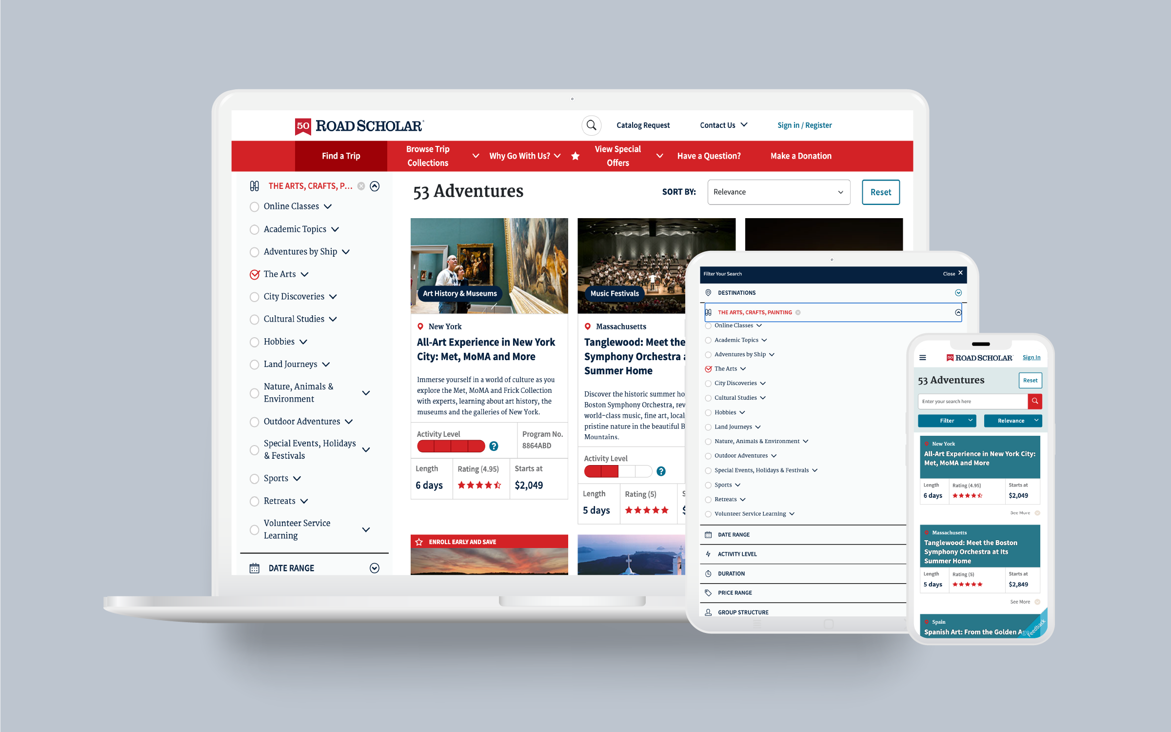
Road Scholar has over 60 different product categories that are used to identify and classify trips by major themes and interests. This project sought to discover how we could make browsing through these interests more user friendly, particularly for mobile users.
Desktop Pop-up modal before UX Research & Design
The Problem
For desktop users, search was working fairly well. The only complaint from internal and external users was that the alphabetically-organized list was LONG - over 60 items long.
For mobile users, however, this large list proved cumbersome and difficult to navigate. Additionally, there were a number of accessibility issues around search on mobile devices that needed to be addressed, including some particularly buggy front-end web code that impeded the user experience.
The Goal
The goal was to redesign the advanced trip finder for mobile users to improve user experience and accessibility. Our hypothesis was that by improving this experience, users would have better success in finding the kinds of trips they were looking for, thereby increasing web conversion.
Mobile Pop-up modal before UX Research & Design
Understanding the User
Researching internal and external users
There were two groups of people I decided to study as users for this advanced trip finder. The first, obviously, was the primary demographic of baby boomers and senior citizens, and their understanding of our product categories.
I also chose to involve our internal users - namely, the contact center staff. This is because our external users frequently call the contact center for help with technical issues, and those calls frequently morph into a lesson on how to use the website and helping customers search for trips according to their interests - therefore, it was extremely important that we get input from the teams on the front line helping our users.
Card Sorting
Combining Optimal Workshop’s card sorting with UserTesting vidoes, I created an open-sort study and asked users to group the 60+ interests into categories and asked users to answer the following questions:
· What items were the easiest to group, and why?
· What items were the most difficult to group, and why?
· Take a look at the groupings you made and explain why you chose those category names.
Next, I created a second hybrid-sort, using the category names provided by users from the first study to confirm that these naming conventions made sense.
The Cardsorting
Matrix results
Wireframing & Prototyping
From the results, I made language recommendations for the interest categories as well as for the interests that were difficult for users to place. Most of these interests were Road Scholar-branded terms for product lines that we had developed that were unlike any other travel company’s product lines.
Wireframe
High Fidelity Mockup
Prototypes
Links: Mobile | Tablet | Desktop
The Results
We developed the prototype into a functioning application and conducted an A/B split test, directing half of our website visitors to the new search experience and half to the legacy search experience. The new search experience showed an 18% increase in conversion, and was launched in August 2020.