Building Road Scholar’s Design System
As part of Road Scholar’s ongoing digital evolution, one of my top priorities was to create a comprehensive library of all web components. For too long, designers had been working without a centralized system, leading to inconsistencies across departments and fragmented definitions for key landing pages and product sections. This lack of alignment made it difficult to maintain a cohesive user experience—and highlighted the urgent need for a unified design language.
Our primary goals for building out a design system were:
Establish Visual and UX Consistency: Create a cohesive look, feel, and user experience across all digital touchpoints by standardizing typography, color, spacing, buttons, forms, interactions, etc.
Accelerate Design and Development: Provide reusable components and guidelines to speed up product creation, reduce handoff friction, and increase productivity.
Improve Collaboration Across Teams: Build a shared language and toolset that aligns cross-functional teams and streamline workflows.
Enhance Quality and Accessibility: Bake in accessibility, responsive behavior, and interaction best practices so every component meets quality standards by default.
Support Scalability and Maintenance: Create a scalable foundation that allows teams to evolve products efficiently while keeping everything aligned to a central system.
Enable Innovation by Reducing Repetitive Work: Free up time for strategic thinking, experimentation, and user-centric innovation.
Create Documentation and Institutional Knowledge: Centralize documentation of design rationale, usage rules, and implementation details to preserve institutional memory and onboard new team members faster.


Getting started.
To lay the groundwork for a design system, I started by importing what limited documentation existed from the agency Road Scholar had hired in 2015. While sparse, it included basic guidance on typography, color, grid, breakpoints, and iconography.
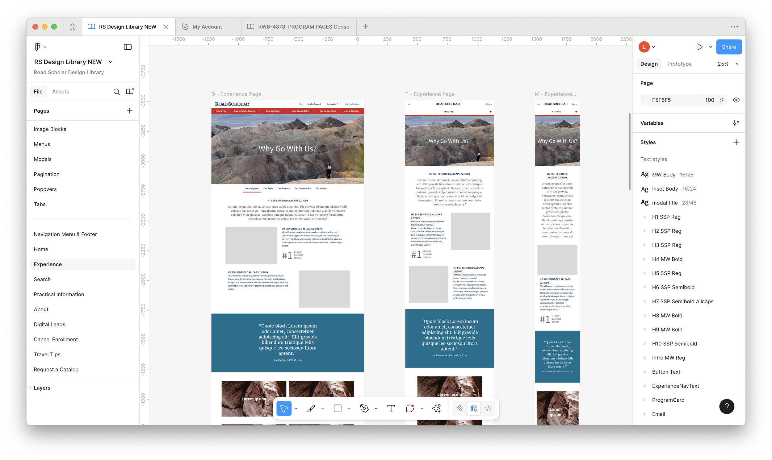
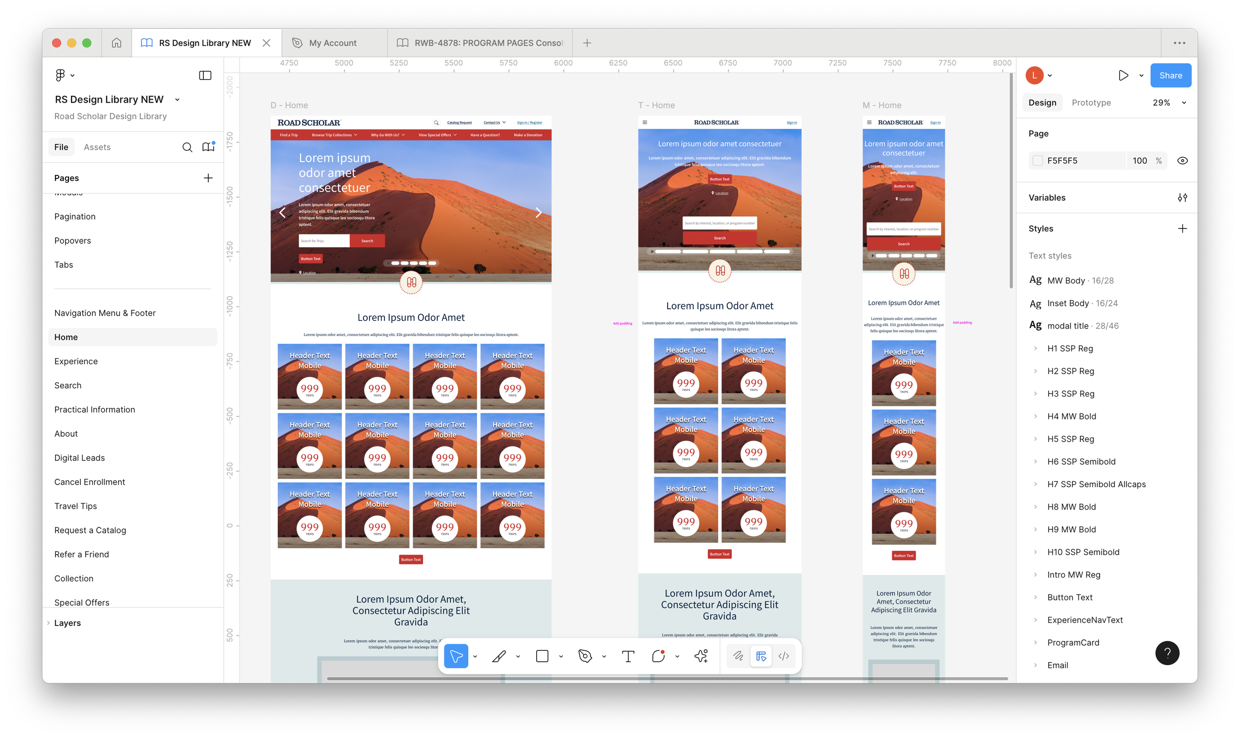
From there, I took a comprehensive audit approach: I began mapping the entire Road Scholar website in Figma—every page, article, and UI component. I brought on an intern to help catalog every variation of navigation, accordions, menus, typography styles, and their usage patterns across different viewports.
This deep dive revealed just how fragmented our visual language had become. We began organizing the Figma file into structured component libraries, creating dedicated pages for buttons, accordions, menus, forms, and more. This process uncovered significant opportunities to consolidate redundant styles and patterns.
One of the most revealing discoveries was the inconsistent use of color. Years of organic growth had left the site with an overwhelming—and often conflicting—range of color definitions, undermining both visual coherence and accessibility. Documenting this helped us lay the foundation for a more unified and scalable system.
How it’s going:
While still a work in progress, the Design Library has already proven to be an invaluable tool. It surfaces pre-defined solutions for many stakeholder requests, allowing the design and web teams to respond more quickly and consistently. As a result, collaboration between the two teams is faster, more efficient, and less prone to miscommunication.
Additionally, the documentation has helped us identify gaps in our existing design patterns and user flows early in the process—giving us a clearer path forward when tackling new projects.
Next Steps
As our team continues to grow, my goal is to expand our Figma documentation to include all digital design assets—such as emails, app interfaces, and banner ads—to provide a comprehensive view of Road Scholar’s digital presence. This work will ultimately contribute to a new brand guide that Road Scholar plans to publish in 2026.